Wednesday, June 30, 2010

Lab 1b: The 7.5 Minute Map

1. What is the name of the quadrangle?

It is called Beverly Hills Quadrangle.

2. What are the names of the adjacent quadrangles?

There are 7 adjoining quadrangles: Canoga Park, Van Nuys, Burbank, Topanga, Hollywood, Venice and Inglewood.

3. When was the quadrangle first created?

It was first created in 1966, however additional data added in 1978 and verified in 1998.

4. What datum was used to create your map?

NAD83 (North American Datum of 1983)

5. What is the scale of the map?

The Scale is 1 : 24000

6. At the above scale, answer the following:

a) 5 centimeters on the map is equivalent to how many meters on the ground?

1200 meters

b) 5 inches on the map is equivalent to how many miles on the ground?

1.89 miles

c) one mile on the ground is equivalent to how many inches on the map?

.38 inches

d) three kilometers on the ground is equivalent to how many centimeters on the map?

12.5 centimeters

7. What is the contour interval on your map?

20 feet

8. What are the approximate geographic coordinates in both degrees/minutes/seconds and

decimal degrees of:

a) the Public Affairs Building?

34º04’62’’N, 118º26’15’’W

34.08388ºN, 118.43749ºW

b) the tip of Santa Monica pier?

34º00’28’’N, 118º30’00’’W

34.00778ºN, 118.5ºW

c) the Upper Franklin Canyon Reservoir?


34º06’11’’N, 118º24’53’’W

34.1031ºN, 118.4231ºW

9. What is the approximate elevation in both feet and meters of:

a) Greystone Mansion (in Greystone Park)?

560ft or 170.7m

b) Woodlawn Cemetery?

140ft or 42.7m

c) Crestwood Hills Park?

725ft or 221m

10. What is the UTM zone of the map?

UTM Zone 11.

11. What are the UTM coordinates for the lower left corner of your map?

Northing 3763000, Easting 3615000

12. How many square meters are contained within each cell (square) of the UTM gridlines?

It is 1 sq. kilometer, so 1000m X 1000m = 1,000,000 sq meters.

13. Obtain elevation measurements, from west to east along the UTM northing 3771000,where the eastings of the UTM grid intersect the northing. Create an elevation profile using these measurements in Excel (hint: create a line chart). Figure out how to label the elevation values to the two measurements on campus. Insert your elevation profile as a graphic in your blog.


14. What is the magnetic declination of the map?

The magnetic declination is 14 degrees + 48 minutes = 14o48’

15. In which direction does water flow in the intermittent stream between the 405 freeway

and Stone Canyon Reservoir?

The Stream runs from north to south.

16. Crop out (i.e., cut and paste) UCLA from the map and include it as a graphic on your

blog.


Sunday, June 27, 2010

Lab 1a: Maps

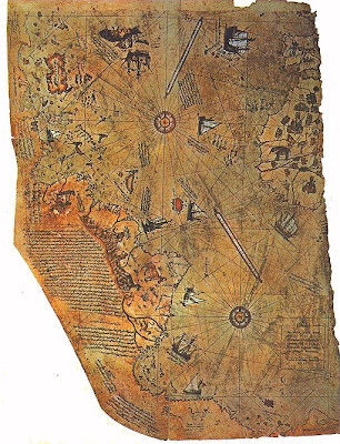
I found this map is from the University of Wisconsin website after searching for historical maps of North America. The map is called the Piri Reis Map and is considered the oldest known surviving map to show the American continents. (http://www.uwgb.edu/dutchs/pseudosc/piriries.htm) To start with, I find this map interesting because it shows the relative luxury we have in the modern world of a more uniform method for representing space. I think it is safe to say that most modern maps you can expect to encounter will utilize the system of latitude and longitude or a fairly simple grid system if you are on a more local scale, such as for city maps. However, even more interesting is that older maps show the historic challenges faced in making maps that often resulted in many inaccuracies. For example, in this map the outline of the Atlantic coast of South America and Europe are distinctly visible, however, North America appears almost unrecognizable to anyone who has a general geographic knowledge of North America. Historically it was enough of a challenge to generate an accurate geographic map and now with internet access, the majority of the world can find a map of almost any region in the world, not to mention detailed maps used for analytic purposes beyond analyzing distance, topography and other basic geographic knowledge.


This is a map I found online (http://www.inmotionmagazine.com/auto/mapofla.html) in an article concerning environmental racism in Los Angeles. In detail, this map documents the correlation between where people of color live and clusters of point source pollution, such as waste disposal, factories or any facility that has a negative externality on surrounding communities as a result of releasing toxic substances. Though I am not familiar with this specific magazine or the reputability of this source, I have seen similar maps and studies from academic sources.

This map is of particular interest to me partly because I believe equity and environmental issues are interrelated and understanding the relation between these often assumed separate issues is an important component of environmental science. This map specifically is able to accomplish this by highlighting information that may be overlooked otherwise, such as the fact there is strong regional correlation between where pollution sources are located and who is living there. Even if this information is not overlooked and is considered common knowledge, it is important to compile and consolidate this information into an easy to understand format that is accessible to the public and regional decision makers. I also think this map is interesting because it is a simple demonstration of the modern era of “mapping” that is reliant on extensive and potentially independent sources of knowledge and aggregation of data, such as real estate pricing, demographics, general geography, pollution tracking, building registries etc.


This is a generic map showing the current borders of Palestine and Israel. I found this map just using a quick search on Google that took me to this website: http://www.mideastweb.org/misrael.htm . The reason why I find this map interesting is not because it provides any particularly special type of knowledge. Rather, it is that even a simple regional map such as this carries a historical and emotional component that is not contained in the data the map presents but its ability to evoke different reactions from different people. Here the presentation of the same map you could find hundreds of place all over the internet may take precedence. For example, some people may take contention with the fact the map has the label “Palestine,” rather than “West Bank” or “Gaza.” In this instance, the map and its interaction with the people viewing it becomes as much a sociological study as the phenomenon the map is attempting to document.